Overview
Designed for boba lovers and fun-seekers alike, Astro Balls brings the joy of real tapioca pearls into a convenient canned form, combining bold branding with an out-of-this-world theme. The space-inspired design adds a playful yet polished touch, making bubble tea an experience that stands out on the shelf.
Client
school project
tools
Illustrator
Photoshop
Service
Graphic Design
Branding
Packaging
Duration
1 week


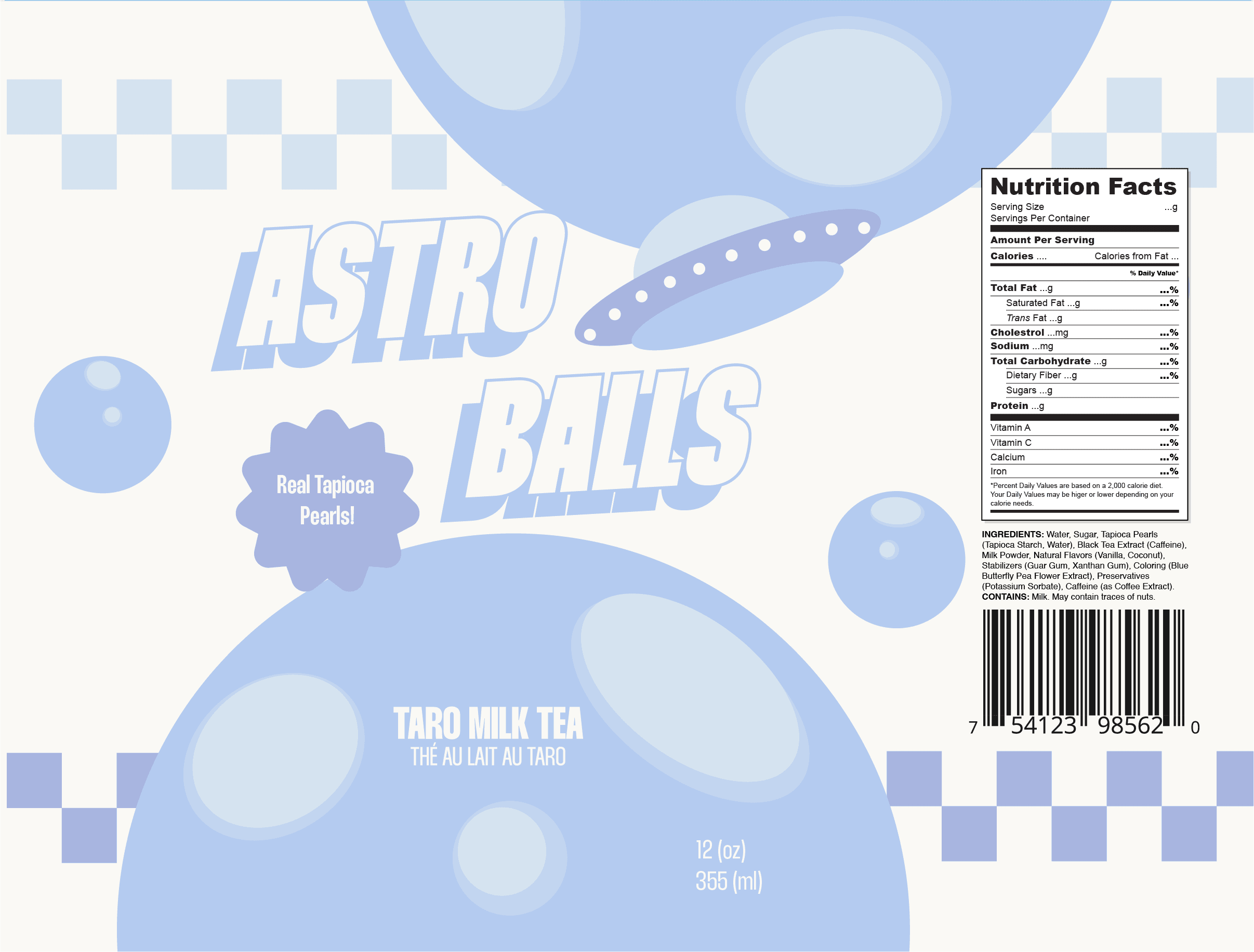

A key part of refining the Astroballs design was improving how it actually looked on the can itself. One major decision I made was removing the top moon element—while it worked in flat mockups, it didn’t sit well with the curved shape of the can. Taking it out made the design feel more cohesive and better suited to the physical product. I also replaced some of the background elements with a checker pattern, which created a more balanced and visually grounded layout. These changes helped the final design feel cleaner, more intentional, and truly ready for the shelf.

This project also marked my first time working with dielines. It was a great hands-on experience, but looking back, I’d definitely remind my past self to double check the dieline dimensions. I learned the hard way that there are multiple variations of 355ml cans, and not all dielines are one-size-fits-all. It was a valuable lesson in prepping files for print and understanding how design translates from screen to physical packaging.


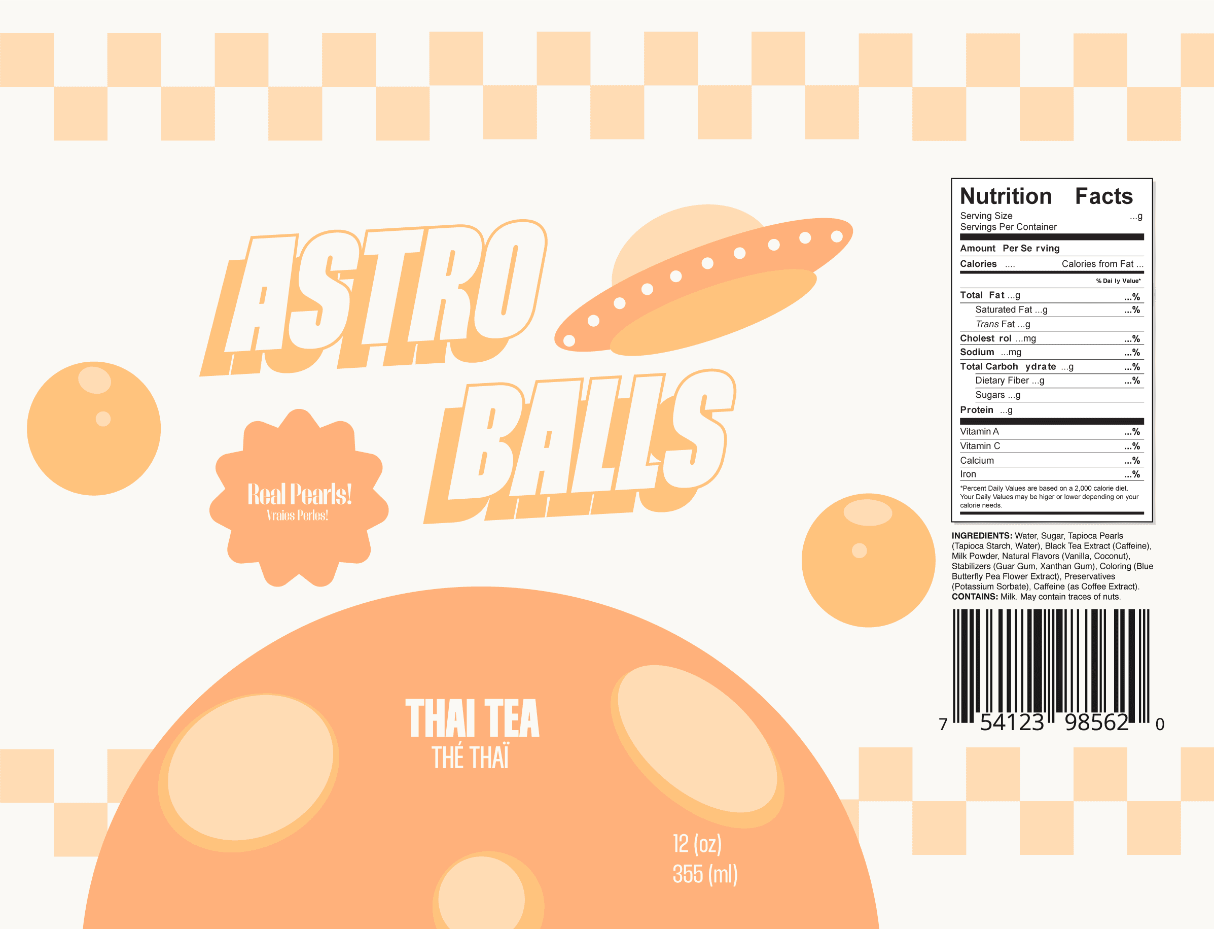
Recoloring the design for two additional flavors was a smooth process thanks to early planning. I had set up reusable color swatches during the first iteration, which made updating the palette quick and consistent. This paid off especially when I had to pivot one of the flavors—originally intended to be mango. I used an orange-based color scheme to represent it, but during user testing, people weren’t associating the color with mango as expected. Rather than force the idea, I shifted the flavor to Thai tea, which matched the bright orange tone and felt much more instantly recognizable. It was a great example of how thoughtful setup and user feedback can work together to shape both the visuals and the overall product direction.