
Overview
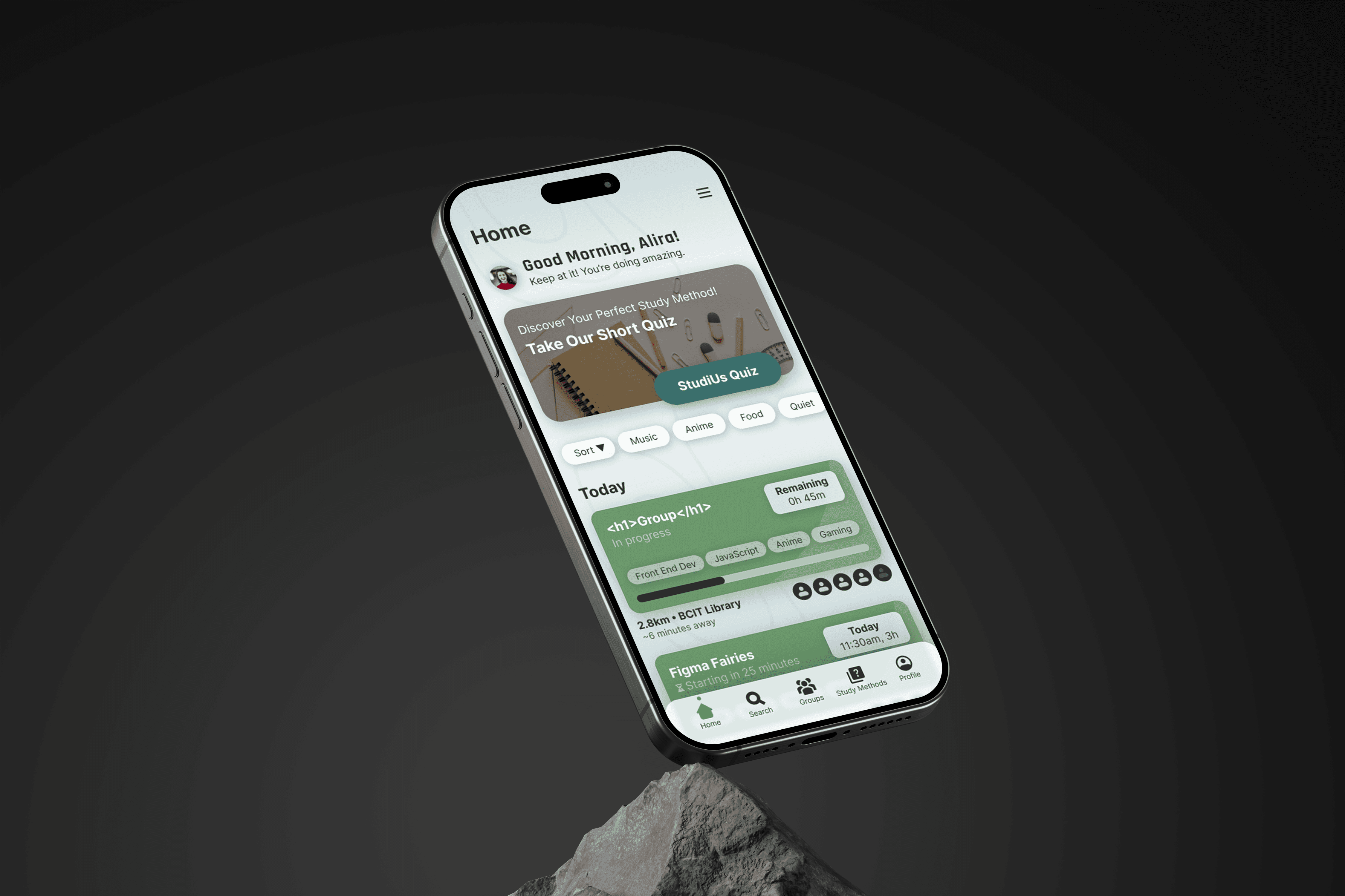
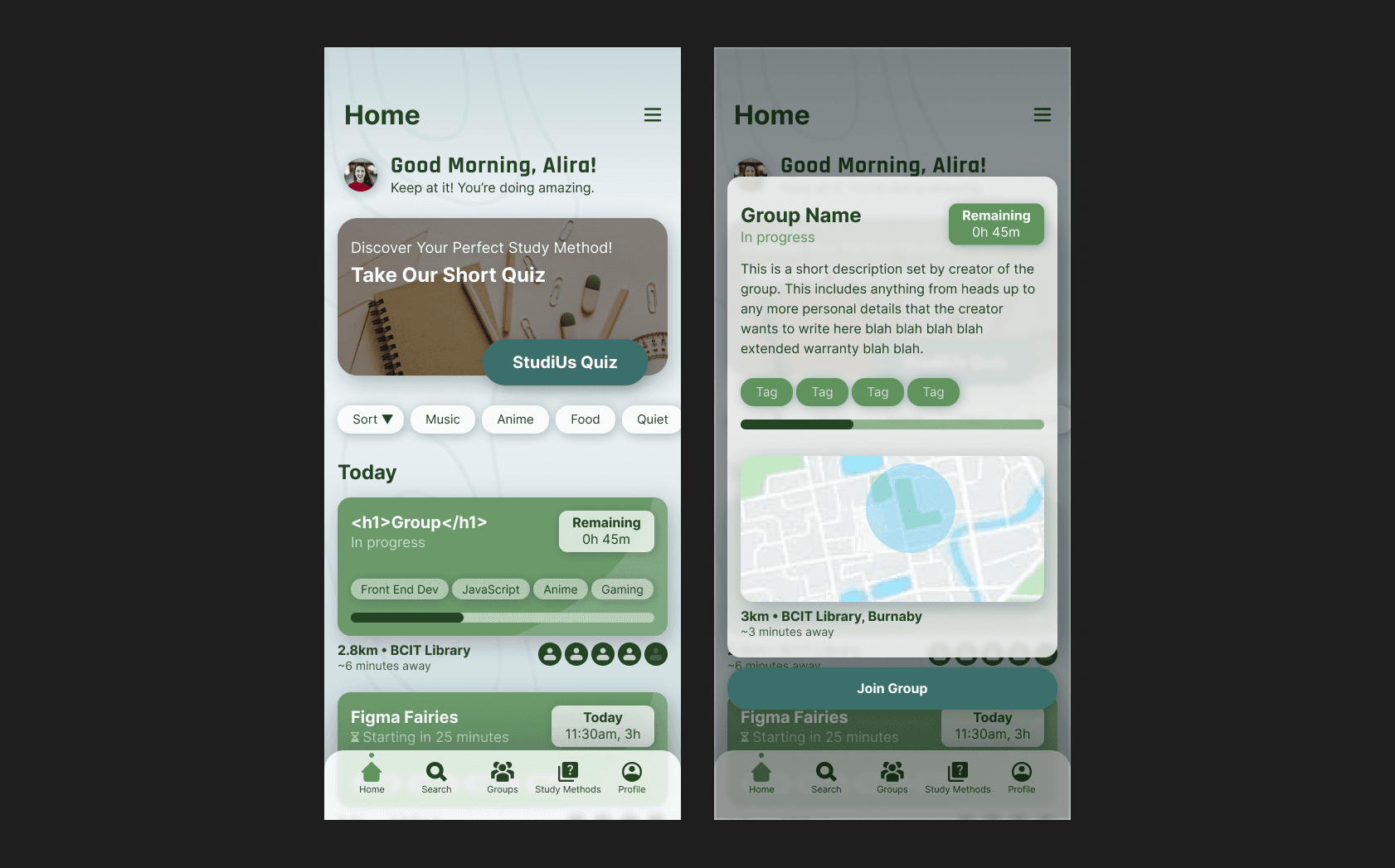
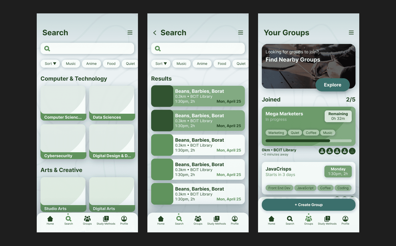
Studius is a study buddy finder and networking tool designed to help students connect with like-minded peers to boost productivity and foster a sense of community. The platform enables students to find study partners based on similar courses, interests, and study habits, facilitating collaborative learning and knowledge sharing. Studius aims to bridge the gap between solitary studying and the benefits of group learning by providing a seamless and intuitive way for students to network.
Client
School Project
tools
Figma
Illustrator
UI/UX Designer
2 Designers
1 Developer
Service
Mobile App Design
Branding
Logo Design
Product Design
Duration
13 Weeks

The StudiUs color palette was thoughtfully crafted to reflect our core values of community, education, and comfort. Each color was chosen to enhance usability while reinforcing our brand's tone and message. You can view the full style guide at the link below.
The site map played a key role in shaping the app’s structure and ensuring clear, intuitive navigation. It helped map out how users would access essential features like uploading job listings, selecting tailored questions, and viewing feedback. This organized layout made it easier to design an experience that feels seamless and aligns with the needs of our target audience.

One of the biggest challenges we faced with Studius—our first long-term project—was setting the scope way too large. Early on, we aimed high with ambitious features like map-based navigation, but we quickly realized it wasn’t feasible to complete within our timeline or with the skillset we had at the time. We ultimately scaled the project down to focus on the core goal: helping users with similar study habits connect more easily.

Another hurdle was our initial obsession with creating “innovative” ways to navigate the app. We spent a lot of time exploring unconventional interactions and layouts, which, while interesting, pulled focus away from core functionality. It distracted from our original purpose—if users couldn’t intuitively move through the app, they wouldn’t be able to find or connect with like-minded study partners in the first place. Simplifying the navigation and aligning it with more familiar patterns helped get us back on track.

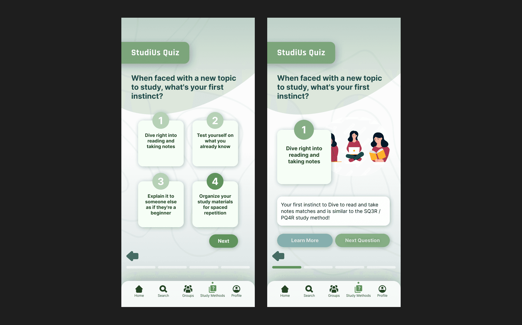
Personally, one design issue I ran into was with the quiz section of the app. In early versions, there were no microinteractions or confirmation states—it would abruptly jump to the next screen without any kind of submit button or visual feedback. It felt jarring and incomplete. I later revised the flow by adding proper submission actions and subtle microinteractions, which made the experience feel smoother and more intentional.

