Overview
Onward is an AI-powered interview coaching web app designed to help immigrant nurses transition into the Canadian healthcare system. By analyzing job postings and resumes, the app creates realistic interview scenarios, offering personalized feedback, targeted practice questions, and performance insights. With each session, Onward helps users build confidence, refine their skills, and take meaningful steps toward career success.
Client
school project
tools
figma
illustrator
photoshop
next.js
Ui/Ux Designer
3 Designers
2 Developers
1 Project Lead
1 Content Creator
Service
Web Design
Branding
Web Development
Duration
11 weeks


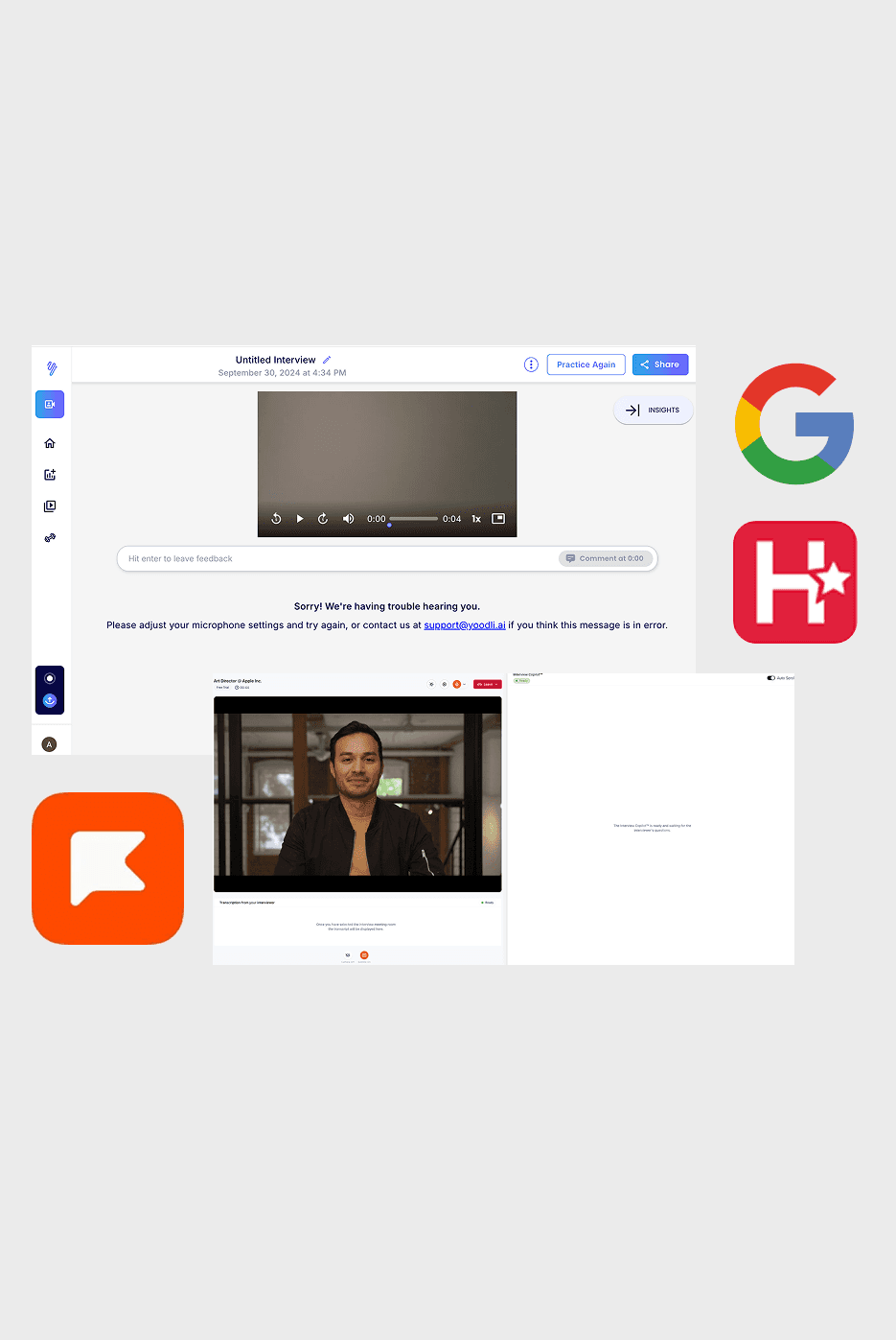
We researched seven interview coaching platforms, including Google’s Interview Warmup, Final Round AI, Big Interview, VMock, HireVue, and TopInterview, to understand the industry standard for this type of application. Through this research, we identified areas for improvement and usability challenges that could impact the user experience. By evaluating what we liked and disliked from our competitors, we refined our approach to create a more tailored, user-friendly experience for immigrants adjusting to the Canadian job market, addressing these gaps to improve accessibility and usability.
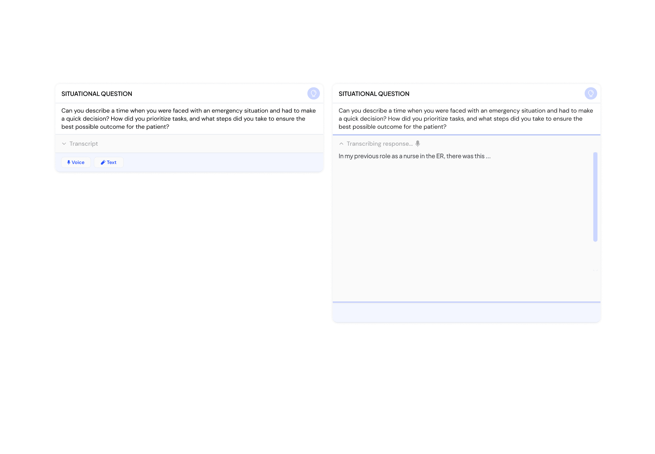
Our primary research involved surveys to understand the challenges immigrants face in job interviews. We focused on nurses new to the Canadian healthcare system, gathering insights on language barriers, cultural differences, and confidence. This helped shape Onward’s features, like personalized questions, real-time feedback, and language support.
Survey respondents highlighted three challenges for immigrant job seekers: communication barriers due to language differences, unfamiliarity with Canadian interview norms, and a need for tailored support like coaching. These challenges impact confidence and performance, emphasizing the demand for targeted solutions.
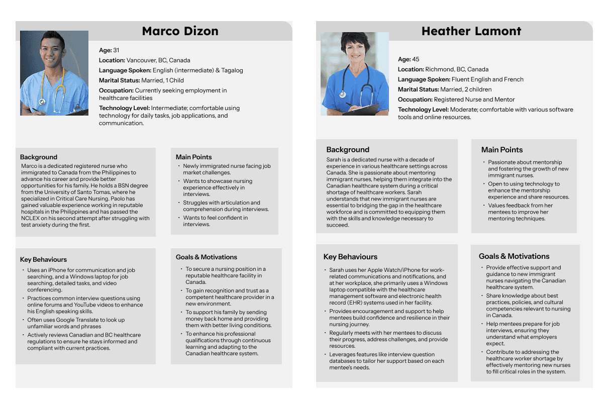
Our primary research involved surveys to understand the challenges immigrants face in job interviews. We focused on nurses new to the Canadian healthcare system, gathering insights on language barriers, cultural differences, and confidence. This helped shape Onward’s features, like personalized questions, real-time feedback, and language support.
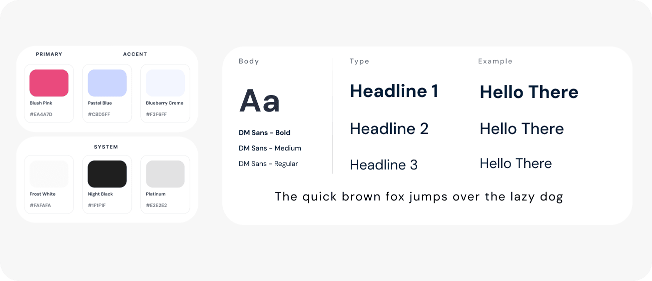


Our style guide establishes the core visual language for the application. The color palette—featuring specific HEX codes—was inspired by the calming, familiar tones of nurse scrubs to subtly reinforce the healthcare context. It also sets typography standards with chosen fonts and sizes, and includes a UI kit featuring components like buttons and navigation elements.
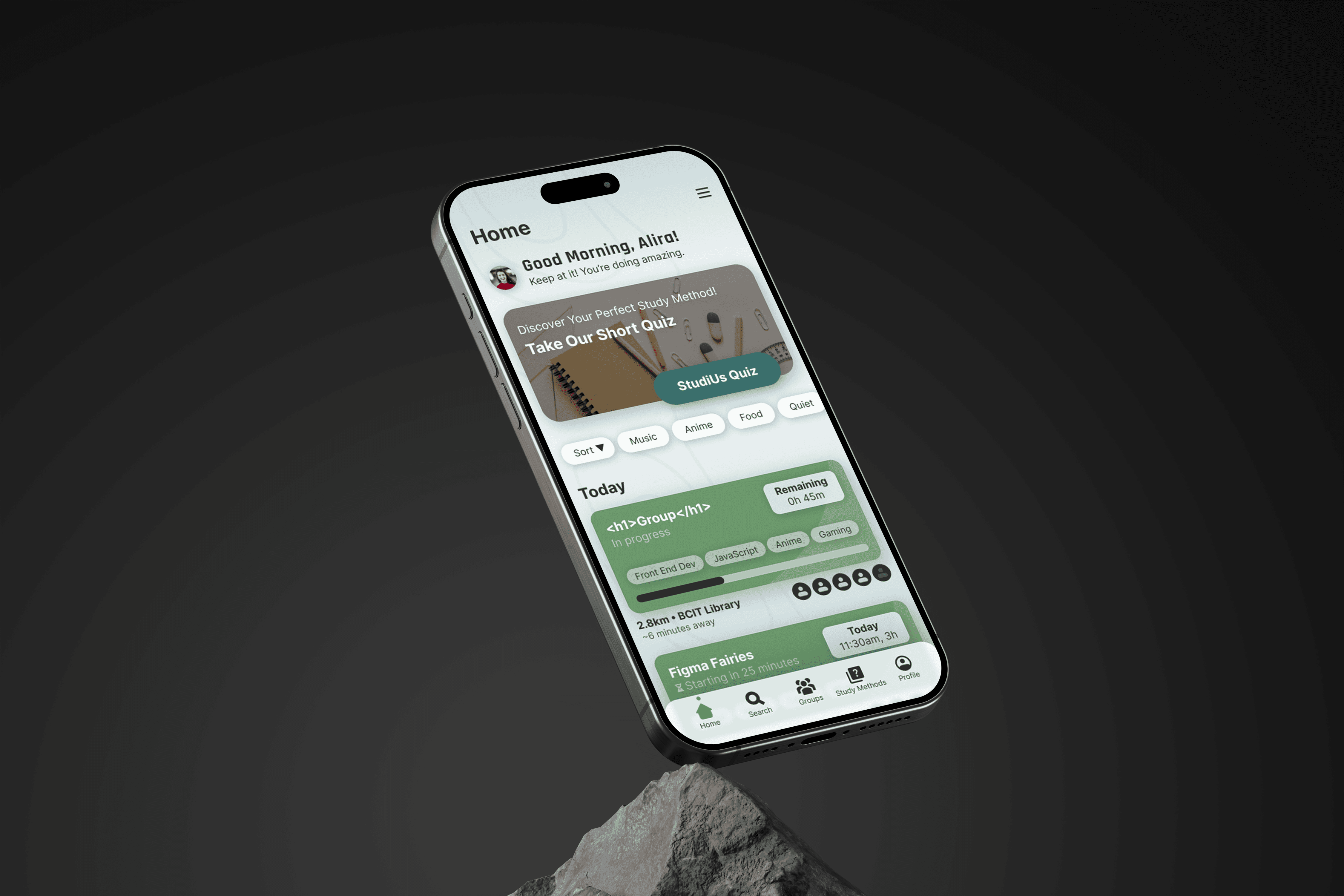
The site map played a key role in shaping the app’s structure and ensuring clear, intuitive navigation. It helped map out how users would access essential features like uploading job listings, selecting tailored questions, and viewing feedback. This organized layout made it easier to design an experience that feels seamless and aligns with the needs of our target audience.


Throughout the design process for Onward, I went through many iterations based on feedback from the client (instructor) and peers. Early concepts evolved significantly after critique sessions, pushing me to refine both usability and clarity. One big learning moment came while collaborating with the dev team—initially, I didn’t consider loading states a priority. It wasn’t until we started integrating designs that I realized how essential they were, especially for components like the question card. This experience taught me to think beyond the static design and consider every state of the user experience.

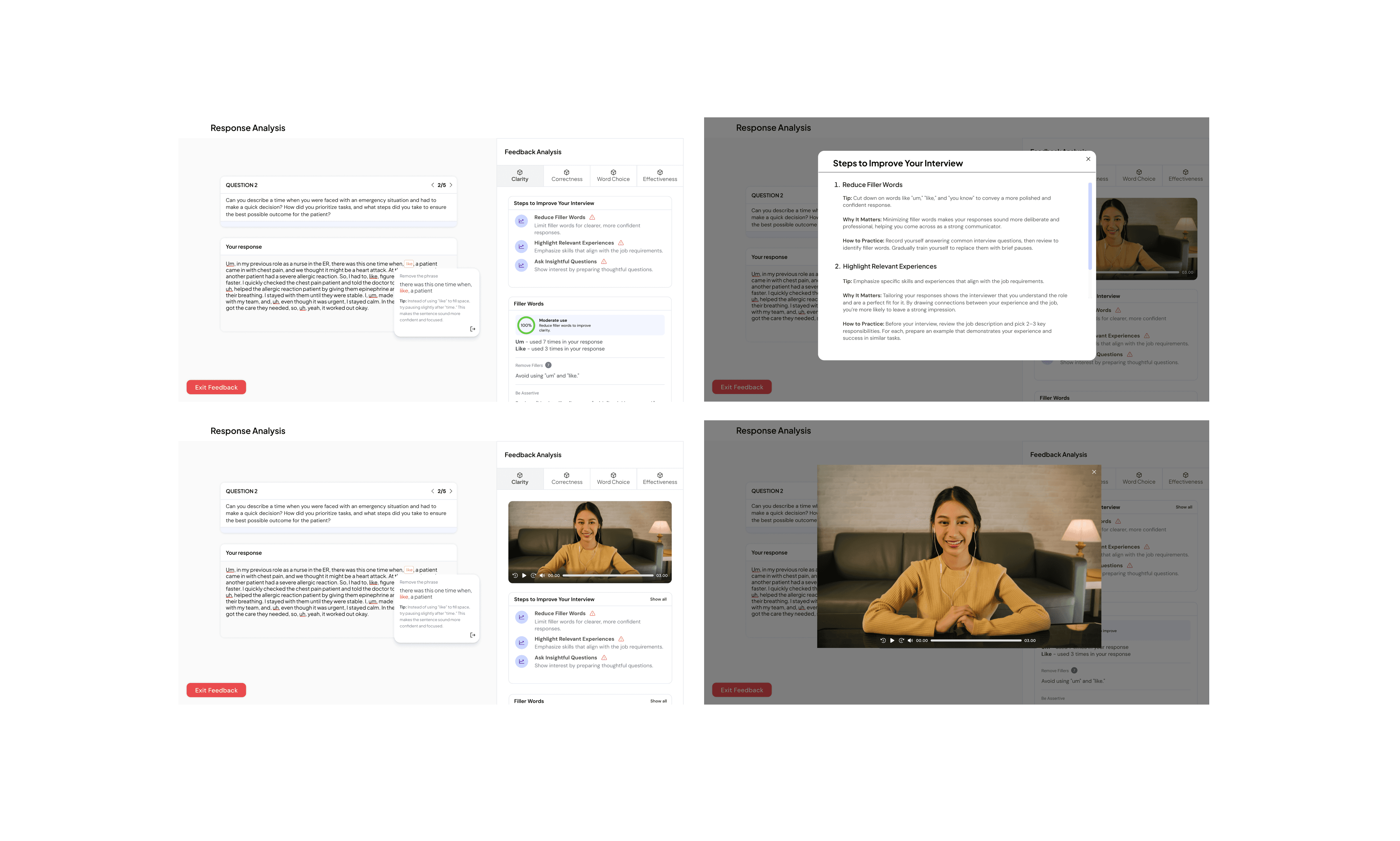
Another challenge was designing the feedback analysis page—an interface that didn’t really exist yet. My first attempt was too dense and text-heavy, even though it functionally worked. Through refinement and research, I drew inspiration from well-designed platforms like YouTube and Grammarly. While not direct competitors, they offered smart ways to organize information visually, helping me create a layout that felt more scannable, clean, and user-friendly.


I was also tasked with designing the dashboard, and something I initially struggled with was the instinct to fill space. There was a temptation to add features just to make the layout feel "full," but through feedback and internal discussions, we made the intentional choice to strip it down. We kept only what was essential and removed unnecessary fluff—prioritizing clarity and function over visual busyness.


Lastly, I learned that simplicity often trumps novelty. I sometimes leaned toward flashy layouts or complex interactions, but they often made the experience more confusing. Peer feedback kept me grounded and reminded me that usability should always come first—because a design isn’t successful if people don’t know how to use it.